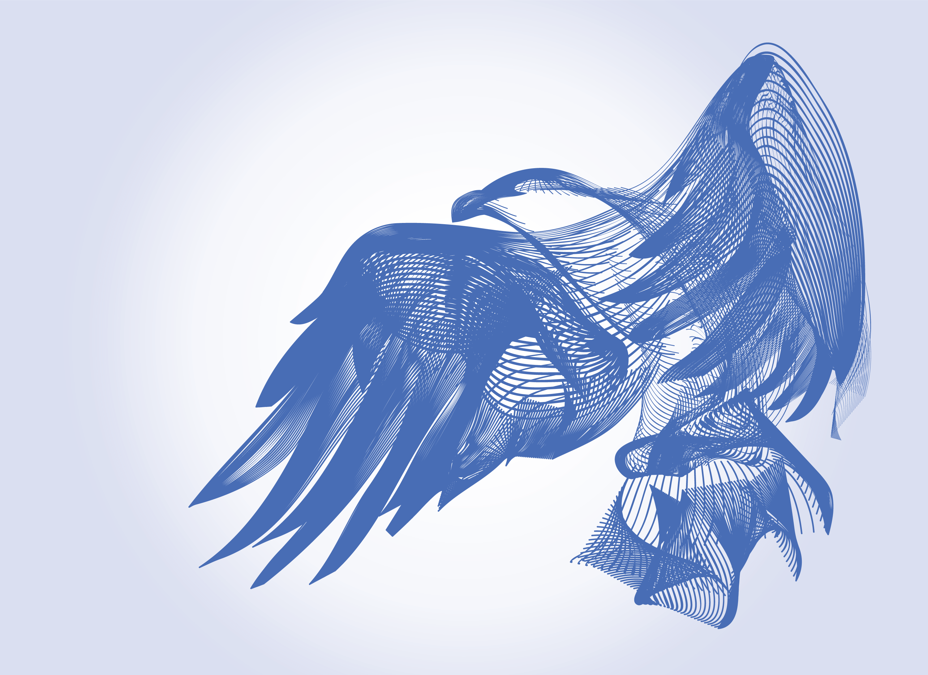
Here at the Berkeley Science Review, the design team works hard to find beautiful ways to visualize data and deconstruct a challenging concept or large body of work into an infographic. Title images, however, are meant to capture the spirit of the article, and are often the place where the designers can let loose. While the cover of the last issue was an incredibly stunning tour de force in data visualization, this semester's cover tries to artistically showcase the powerful new techonologies scientists are using to understand oft-illusive animals.
“Phenomenal cosmic powers, itty bitty living space.”
When I first read Digital catch and release, I was struck by the capacity for modern devices to record a tremendous amount of information about creatures scientists rarely observe directly. I wanted to reflect the peculiarity of this juxtaposition - watching animals without ever seeing them - in the title image. One of the first concepts that came to mind was a genie-in-a-bottle. The idea of an infinitely powerful being trapped in a small space seemed an apt metaphor for accelerometry devices that can be scalable to roughly the size of a quarter. Fortunately, as far as I can tell, these devices are free of the three-wish constraint.
Working off of this initial idea, I began sketching out a few creatures materializing out of microchips. This design quickly substituted wires for a chip, because I felt that the linearity of the wires contrasted starkly to the wispy curves of the animal that I was going for. To make the critter feel like it was billowing out of the leads, and to capture the “smokey” genie effect, I settled on using the blend tool in Illustrator (more on this later). Here, I could trace the outline of the animal with a few rough lines and use the blend function to interpolate between the lines to construct what felt like a highly dimensional, highly logical, reconstruction of the creature. This seemed like an appropriate representation of the digitally captured information.
I felt it was also important to highlight the ability of these devices to record data on the specimen’s movements. To this end, a bird was chosen as my muse, not only because vultures are discussed in this piece but because a flying position implicated dynamic action on the bird’s part. The swooping lines stemming from the circuitry supplied additional dimensionality and momentum to the image.
The toolbox
Our designs are predominantly constructed using Adobe Illustrator, both because the images are vector-based and because Illustrator is jam-packed with tools to help a designer make just about anything. For this project, I decided to use the Blend Tool after stumbling across a really epic tutorial. The blend tool is generally used to evenly distribute a series of identical objects or to create color transitions across a sequence of objects. Some artists have employed this tool to make beautiful line art portraits, and, with basically no drawing experience, I decided this would be a reasonable project for me to take on.
[caption id="attachment\\_12292" align="alignleft" width="1287"][](http://berkeleysciencereview.com/wp-content/uploads/2014/11/bird\_evolution.png) From left to right: original eagle image that was traced (source: Wikipedia), first attempt at the blend tool (apparently this looked like a fish), and final version of the bird for print.[/caption]
To start, I found a picture of an eagle that I liked quite a bit. Then, I traced the basic form of the bird and applied the blend tool with 20 even steps. I quickly discovered that to get the best outcome, I needed to assemble the components modularly, particularly the feathers on the wings. This was challenging because I needed to make sure that the components seamlessly connected to one another, since I wanted the image to look like it was constructed from one, contiguous assemblage of lines.
Another trouble spot was the right wing; because it folded over on itself I needed to find a way to add a sense of dimensionality. I finally found that by changing the size of the stroke, I could highlight concave and convex regimes in the wing (and, subsequently, the bird as a whole). The size of the stroke for the long tail extending to the leads was also decreased to give the tail a gossamer feel. For the cover, this tail needed to be shortened, while still retaining the appearance of the bird exploding out of the circuit. To accomplish this, I ultimately twisted several lines around each other in a pseudo-helix fashion and then blended them pairwise.
[caption id="attachment\\_12294" align="alignleft" width="1272"][](http://berkeleysciencereview.com/wp-content/uploads/2014/11/modular\_assembly.png) The bird was constructed from three main components, however, note that each feather on the wings was individually created.[/caption]
Finishing touches
The final design decision ended up being the color scheme. Generally, we try to maintain a cohesive color palette throughout each piece to tie together all of the graphic elements. I wanted to echo the green and gold hues of a printed circuit board but also keep the bird from feeling too heavy and corporeal. As it turned out, I had acquired an adorable chipmunk photograph for the article that had bright green and orange hues. After using the eyedropper to select my favorite shades, I was all set for the title page. For the cover, the gossamer tail was shortened so the bird could be expanded and a vibrant blue was settled on by the design team so the bird would pop off of the page.
So there you have it! Ultimately, the design process involves a lot of collaboration, a lot of edits, and in this case, even more Bézier curves.

](http://berkeleysciencereview.com/wp-content/uploads/2014/11/bird\_evolution.png)
](http://berkeleysciencereview.com/wp-content/uploads/2014/11/modular\_assembly.png)